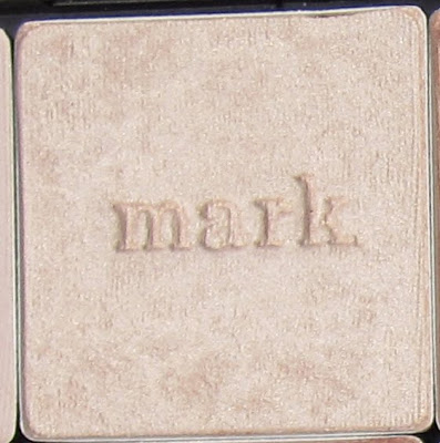
The simplicity of mark. eye shadows appealed to me from the first time I saw them- they're square, have a the "mark." logo imprinted in the center of the shadow, and can easily be popped in and out of palettes and rearranged. Initially I started with 8 colors in the spring of 2009, and after using them several times I sort of forgot about them...Then, when I discovered an Avon Store in the San Francisco Bay Area (who knew there were Avon stores?!) I decided to pop in and check out the other colors. Several of the shades I wanted to try were out of stock, so I hopped online and placed an order for some colors I didn't have but wanted to try. I already owned a couple mark. palettes, but instead of purchasing more, I decided to house the shadows in a MAC palette (for storage reasons- something I plan to talk about in a subsequent post).

18 colors fit nicely into the MAC palette. As pictured above, I created a nice neutral palette that I really like.
Below you can see the size difference as compared to the mark mega palette that holds 8 shadows.
There are two other sizes of mark. palettes available, the mezzo (pictured below) and the mini that fits two colors.
As for the colors in my neutral palette, I think all of them would be flattering on almost any skin color. I think that mark. has aimed to create very wearable colors, for the most part. The only thing to watch out for with these shadows is the finish- some of them have micro glitter, and I think that is something most of us over the age of 20 want to avoid (for daily wear). See my descriptions and swatches to get an idea of how the colors will appear when applied to the skin.Neutral Colors
 whisper (matte)
Flat pale ivory-beige that is great as a highlight or base color. Pigmentation is middle of the road (i.e. not sheer but not totally opaque either).
 biscotti (shimmer)
Shimmery (with micro glitter/ large shimmer- however you want to look at it) sheer ivory color. this works well applied across the entire lid and in the inner corner. I wouldn't use it as a highlight due to the level of shimmer. This color doesn't have great color payoff, so I would use it to add a touch of shimmer, more than anything else.
 nomadic (shimmer)
Shimmery (with micro glitter/ large shimmer) sheer pale buttery gold. This works well applied across the entire lid and in the inner corner. I wouldn't use it as a highlight due to the level of shimmer. This color doesn't have great color payoff, so I would use it to add a touch of shimmer, more than anything else.
 stellar (shimmer)
Light shimmer/ sheen finish pale golden yellow. This color is beautiful applied across the entire lid, or in the inner corner of the eye. Pigmentation is good, but is not totally opaque.
 magic (shimmer)
Light shimmer/ sheen finish pale golden copper. This color is beautiful applied across the entire lid. Pigmentation is good, but is not totally opaque.
 cake (shimmer)
Light shimmer/ sheen finish baby pink. This color is beautiful applied across the entire lid, or in the inner corner of the eye. For light to medium skin tones, this may work well as a warm highlight color. Pigmentation is sheer.
 latte (matte)
Flat warm beige. This is a nice highlight color for tan- deep skin tones, and words well as a crease/ blending color for fair- light skin tones. It would also work well as a base color applies across the entire lid. Pigmentation is middle of the road.
 fairy dust (shimmer)
Shimmery (with micro glitter/ large shimmer) rosy warm beige. This works well applied across the entire lid and in the inner corner. I wouldn't use it as a highlight due to the level of shimmer. Pigmentation is middle of the road.
 minx (shimmer)
Light shimer/ sheen finish mid-tone taupe with cool undertones. This is beautiful as a base color applies across the entire lid, or as a standalone color. Pigmentation is middle of the road, but can be intensified by layering.
 gioia (shimmer)
Shimmery/ sheen finish mid-tone neutral brown. This color is beautiful as a stand alone color across the entire lid, or when used to subtly deepen the crease. Pigmentation is good, but is not completely opaque.
 tiki (shimmer)
Shimmer (micro glitter/ light shimmer) finish warm golden brown. This color is beautiful as a stand alone color across the entire lid. I don't think it is the best color for the crease, given the level of shimmer. Pigmentation is middle of the road, but can be layered for more intensity.
 espresso (matte)
Flat warm brown with red undertones. This is a nice color for deepening the crease. Pigmentation is good but is not completely opaque.
 glitterati (shimmer)
Shimmery/ sheen finish pale silver. This color is beautiful when applied across the entire lid. Shimmer fallout can be a problem, so patting this color onto the lid rather than sweeping it will help to prevent fallout. Pigmentation is a bit sheer, but can be built to medium opacity.
 lotus (shimmer)
Shimmery/ sheen finish pale lilac. This color is beautiful when applied across the entire lid. Shimmer fallout can be a problem, so patting this color onto the lid rather than sweeping it will help to prevent fallout. Pigmentation is a bit sheer, but can be built to medium opacity.
 wink wink (matte)
Flat beige with purpley- grey undertones. This color works well when applied as a base color across the entire lid, or as a crease color for subtle definition. Pigmentation is middle of the road.
 plum velvet (shimmer)
Shimmer/ sheen finish mid-tone burgundy. This color is beautiful in the crease, but can also be applied across the entire lid for a bold eye look. Pigmentation is good, but is not completely opaque.
 java (shimmer)
Shimmer/ sheen finish deep neutral brown w/ copper shimmer. This color is beautiful in the crease, but can also be applied across the entire lid for a bold eye look. Pigmentation is good, but is not completely opaque.
 corset (shimmer)
Shimmer/ sheen finish charcoal black. This color is a few shades lighter than a straight-up black, so some may find it easier to blend. Pigmentation is good, but is not completely opaque.
Bright Colors
I also have six bright colors. I don't wear them very often, but they are nice to mix with neutrals, or even to wear alone on occasion.

(The blush pictured is angelic. It is filled with chunky glitter. I would not recommend it to anyone. I believe this color has been discontinued.)
 dragonfly (shimmer)
Shimmer/ sheen finish lime yellow. Pigmentation is middle of the road, but can be layered for more opacity.
 retro peacock (shimmer)
Shimmer/ sheen finish deep blue-teal. Pigmentation is very opaque.
 night owl (shimmer)
Slightly shimmery finish deep blue. Pigmentation is good, but is not completely opaque.
 pool (shimmer)
Light shimmer finish aqua color. Pigmentation is middle of the road, but can be layered for more intensity.
 picadilly (shimmer)
Light shimmer deep purple. This color actually looks more matte when applied. Pigmentation is opaque, but applies patchy.
 apple (shimmer)
Shimmer/ sheen finish coral. Pigmentation is good but is not completely opaque.
Swatches
whisper - biscotti - nomadic
latte - fairy dust - minx
glitterati - lotus - wink wink
stellar - magic - cake
gioia - tiki - espresso
plum velvet - java - corset
dragonfly - retro peacock - ocean drive
pool - piccadilly - apple
 whisper (matte)
 nomadic (shimmer)
 stellar (shimmer)
 magic (shimmer)
 cake (shimmer)
 latte (matte)
 fairy dust (shimmer)
 minx (shimmer)
 gioia (shimmer)
 tiki (shimmer)
 espresso (matte)
 glitterati (shimmer)
 lotus (shimmer)
 wink wink (matte)
 plum velvet (shimmer)
 java (shimmer)
 corset (shimmer)
 dragonfly (shimmer)
 retro peacock (shimmer)
 night owl (shimmer)
 pool (shimmer)
 picadilly (shimmer)
 apple (shimmer)


